Articles & Features
From Mineral to Canvas: A Short History of Primary Colours
We are bound to think that colour is a natural phenomenon: you may claim that yellow expresses optimism, red recalls passion or anger and so on, so much so it can’t surely be otherwise. But actually, colours are a cultural construct, and their complex meanings can vary depending on the context. Partly because of this close relationship with culture, and partly because each colour stands apart from comparison with another, in this overview we are going to discover the significance of colours and their materials throughout art history, with a focus on their use and meaning in western culture. To consider other cultures would be equally as fascinating, but would necessitate a much longer investigation.
“I want a red to be sonorous, to sound like a bell”
Pierre-Auguste Renoir
Red
Red has accompanied humanity since time from the remote past; it is the archetypal colour, the first one to be mastered and manufactured in various shades by man. And this is probably why its deeply evocative power can be hardly equalled in terms of cultural meaning. Not only it was the first one chronologically, but also the colour par excellence, at least until the Renaissance.
Suffice to say that, still to date, in some languages the exact same term, depending on the context, can weather mean “red” or “coloured”.
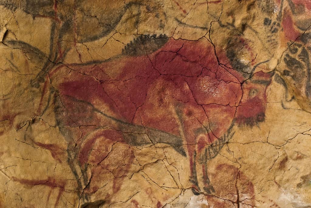
It is from the earth that the oldest pigment originated: the practice of body and cave painting with red ochre, a clay coloured by iron oxide, brought together many different prehistoric civilizations across the globe and, in Europe, utilised at Pech Merle and Lascaux in France, and at the Altamira Caves in Spain, which are respectively about 25,000 and 15,000 years old.
The complex meaning of red is both fascinating and controversial; it held such varied connotations as to be contradictory, at times indicating diametrically opposed ideas.
In antiquity, it stood for courage and war, but also for wealth, power, and fertility, while during the Middle Ages, the religious connotation intensified. If, on the one hand, it symbolised God’s love – referring to the blood of Christ and his sacrifice – on the other, it evoked the fires of Hell. Simultaneously, from a secular point of view, it became symbolic of beauty, passion, and sexuality. It was only in the wake of the Protestant Reformation that red began to be considered immoral and obscene recalling the indulgent decadence of the Catholic Church; until the progressive movements and radical left-wing, after the French Revolution, added a political significance to the colour, and in so doing revived its reputation.
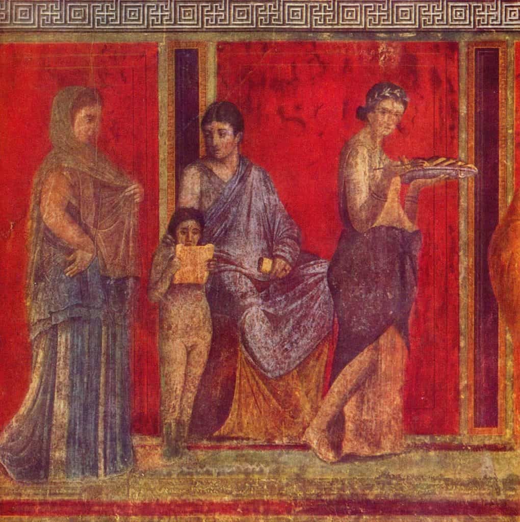
Conversely to what the importance of this colour would suggest, not many red pigments exist, with only a few, mostly ancient and of natural origin, that literally made art history. For many centuries, the king of red pigments was cinnabar, a mercury mineral used for its colour since the 16th century BC. Unlike ochre, which is more opaque and dusty looking, cinnabar appears bright and intense and its vividness can still be admired on the walls of some of the most luxurious villas in Pompeii. When the Chinese technique to produce cinnabar artificially became widespread in medieval Europe, the result was even more surprising and vermilion (this is the name of the synthetic version) replaced both its natural counterpart as well as other pigments such as minium. The latter, also called red lead, was already known during the Roman Empire and was widely used during the Middle Age, in particular to decorate manuscripts with elaborated capital letters and detailed small illustrations. This explains why today we still speak of “miniature” to indicate something tiny.
Whereas both cinnabar and minium had a bright orange undertone, nature generously provided men with deeper shades of red, tending to purple and blue, in the form of animal-based dyes. Among these, the expensive Tyrian red (or imperial dye) derived from the secretion of a family of sea snails which was used to dye luxurious ceremonial robes and made the fortune of the Phoenicians; or Kermes, produced from the dried bodies of insects in the genus Kermes – hence the name – and used by artists to create shiny and translucent glazes, layered atop other less intense nuances. Even if you have never heard of these pigments before and their names sound arcane and exotic, their use was so deep-rooted in the culture that our current language preserves their traces; the English word “purple” is derived from the Latin term for Tyrian red, purpura, and “kermes” is the linguistic root of “crimson”.
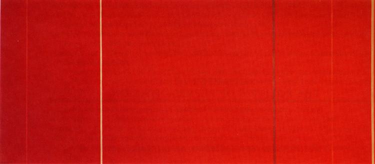
Ironically enough, after a long-standing quest for the perfect shade of red to represent nature as faithfully as possible, in 1910 Cadmium red became available as a product – the major innovation in the history of red pigments – at a time that colour had already been freed from naturalism with the advent of early abstraction. However, the painters of the time, convinced more than ever that the structure of a painting does not lie in the balance between its forms but the relationship between its colours, made good use of this new bright and incredibly stable red, resulting in an explosion of expression.
Even today, after millennia of history, red has not lost its evocative power, indeed if one thinks of the large-sized canvases of the Color-Field group, of Rothko’s and Barnett Newman’s work, it seems that nothing else is able to cause the same mesmeric transcendental and dramatic effect. Furthermore, it appears that red has also unwittingly influenced the art market: paintings featuring the colour red are likely to increase their economic value.
“How lovely yellow is! It stands for the sun.”
Vincent Van Gogh
Yellow
Thanks to yellow ochre, a clay earth pigment similar to red ochre but with a lesser amount of the mineral causing the red colouration – hematite – yellow is one of the oldest colours in art history. The prehistoric cave paintings mentioned above frequently show the combination of the two pigments, together with carbon black, and together represent the absolute beginning of art history, as we currently understand it. In antiquity, the association of yellow with the sun, worshipped by endless religions, made it a common colour. It was the colour of light, power and abundance, and also gold, honey, and wheat, symbolic of immortality for Celts and Germans. However, it has not experienced considerable popularity in the course of history. Still today, despite the fact we generally tend to see yellow as a warm colour, indicating joy and optimism, as soon as it gets a greenish undertone, we find it unpleasant or threatening, perhaps even toxic. In fact, in many cultures yellow was long considered the least attractive colour, and its metaphorical connotations are often negative.
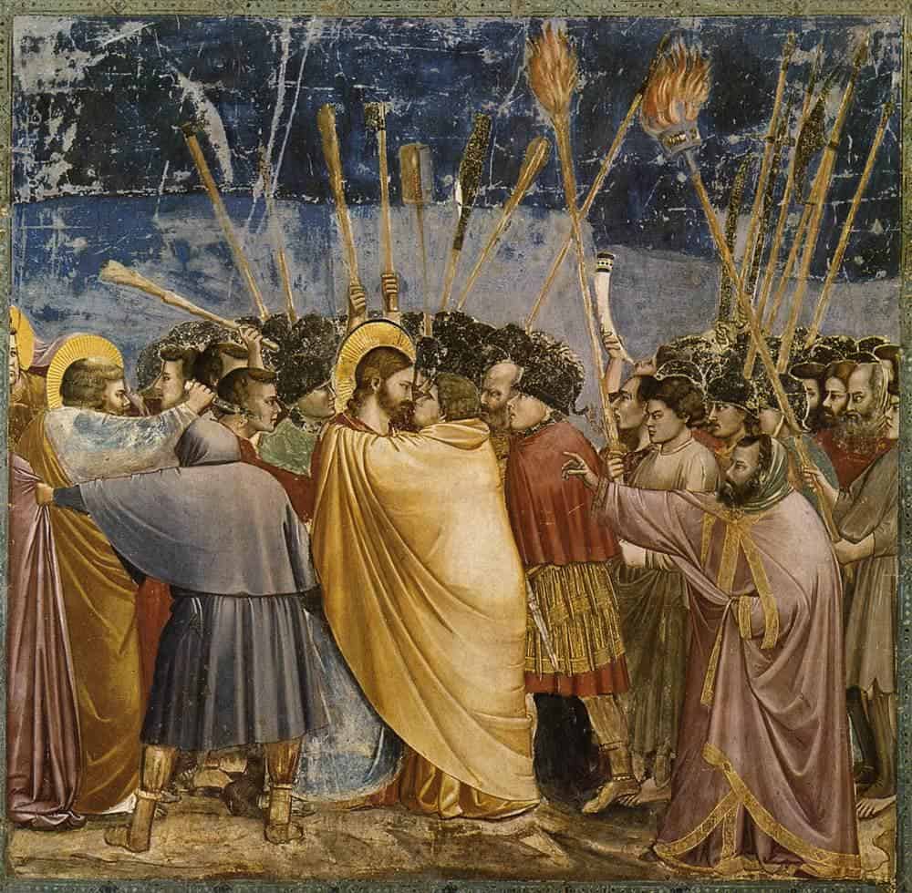
During the Middle Age, yellow became the colour of betrayal, deceit, and cowardice. It is therefore not surprising that Judas Iscariot, the quintessential traitor, was always represented wearing a yellow robe. And in the fresco by Giotto depicting the Kiss of Judas (1304–06), the most famous betrayal ever, Judas’ yellow garment draws entirely around Christ enveloping both he and the viewer’s attention with its sinister veil. Similarly, Saint Joseph is dressed in yellow because he doubted his wife’s virginity, and Saint Peter has yellow and blue robes: the former as a reminder of his denial, the latter to symbolise his privileged position. The colour also grew to represent outsiders of faith, especially heretics and Jewish people. It is no coincidence that, even in the 20th century, Hitler tragically decided to mark them with a star.
Considering the negativity associated with this colour, it is impressive the number of yellow pigments available to artists throughout history. This success in terms of materials is probably due to yellow’s similarity with gold. Orpiment (from the Latin auripigmentum: aurum “gold” + pigmentum “pigment”), derived from an arsenic sulfide mineral, though notoriously toxic, was used until 19th century as affordable alternative to gold; but the game-changer was the introduction to the market of chrome yellow, and latterly, cadmium yellow. Two artists, in particular, loved chromium yellow to the extent our collective cultural perception of the colour in the past two hundred years has been greatly shaped by their extensive usage. They were William Turner and Vincent Van Gogh.
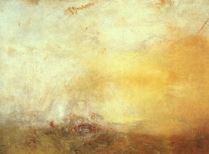
Turner was mocked by art critics of the time, who claimed that his images were “afflicted with jaundice” – a disease causing a yellowish or greenish pigmentation of the skin – and that the artist may be colour-blind. Heedless of criticism, the artist also experimented with unusual materials and, to realise his magnificent sun-lit landscapes, also used Indian yellow – a fluorescent dye derived from the urine of cows fed with mango leaves. And how can one not think of the joyful hue of van Gogh’s work? It was only thanks to Chromium yellow that the Dutch artist was able to recreate the shining light he found in the sun drenched fields and flora of Southern France. The joyful yellow shade we know so well and that is now tragically fading into a more muted tone akin to brown, led Paul Gauguin to say of his onetime friend “Oh yes! he loved yellow, this good Vincent, this painter from Holland – those glimmers of sunlight rekindled his soul, that abhorred the fog, that needed the warmth”.

“Blue has no dimensions. It is beyond dimensions.”
Yves Klein
Blue
According to Pliny the Elder, one of the most informative chroniclers of antiquity, the only worthy palette of a respectable artist consisted of red, yellow, and black. It’s not that blue was not taken into account, simply the concept of blue did not exist and the ancient Greeks did not have a word for it; Homer himself used to describe the sea as ‘wine-dark’ coloured rather than blue. Also the Romans, although aware of some blue pigments, did not give great value to blue; on the contrary, associated with the robes of barbarian populations, it had negative connotations. Only the ancient Egyptians considered the blue symbolic of sky, and water – consequently the River Nile, and in turn connected to fertility and venerated for this evocation. Through incredibly advanced technology, they developed the so-called “Egyptian blue”, considered the first synthetic pigment in all history.
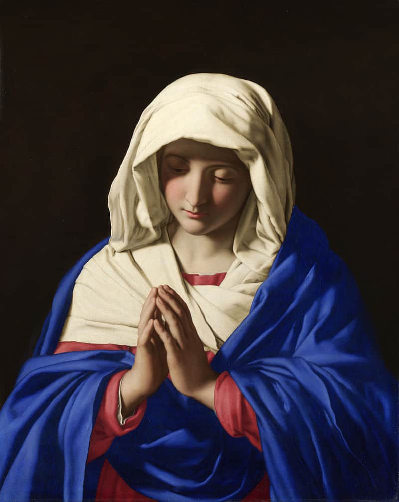
Things started to change when, between the 14th and 15th centuries, Venetian traders began to import to the European market a new deep-blue pigment, so intense that nothing similar had been seen before. This precious material was produced by grinding lapis lazuli, a semi-precious stone that for centuries could only be found in a specific area of Afghanistan, and soon became known as ultramarine (from the Latin literally “beyond the sea”). Partly because of its vividness, partly because of its lavish cost, this pigment was deemed a luxury, with its price rivalling even that of gold. Due to the outstanding price tag and its resultant place in the pigment hierarchy, rather than a particular religious symbolism, ultramarine’s hue became the official iconographic colour of the Virgin Mary’s robes and later associated with royalty.
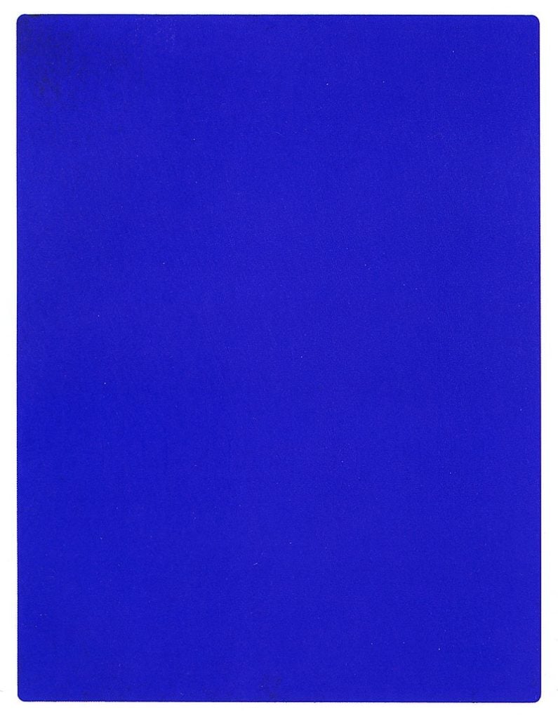
And it was precisely ultramarine blue that inspired the French artist Yves Klein when, after deciding to embark on a monochrome period, he produced and patented, in 1955, a new and striking blue, known as IKB-International Klein Blue. With his monochromatic work, Klein showed the magnificence of an avant-garde embracing modern materiality, inviting the viewer to be enchanted by the beauty of pure colour. Of course, the development of this new colour became possible only when the chemical industry had achieved a certain level of maturity.
But even before the renown of this blue, another pigment had already revolutionized the world of blues, and its history is a clear example of an influence of a single pigment amongst different cultures and their production of artistic material.
In 1705, the casual collaboration between a colourful theologian in search of an immortality elixir named Johann Conrad Dippel, and the paint manufacturer Johann Jacob Diesbach, led to the accidental invention of what was later called Prussian blue. The value of this new pigment, relatively stable and quite cost-effective, was immediately obvious, and in Europe a “blue fever” spread.
During the 19th century, despite Japan’s strict ban on all imports and exports, the pigment found its way to the printmaking industry in Osaka and the celebrated artist Katsushika Hokusai was among the first ones to boldly embrace the material; his emblematic work representing The Great Wave is a superb example of it.
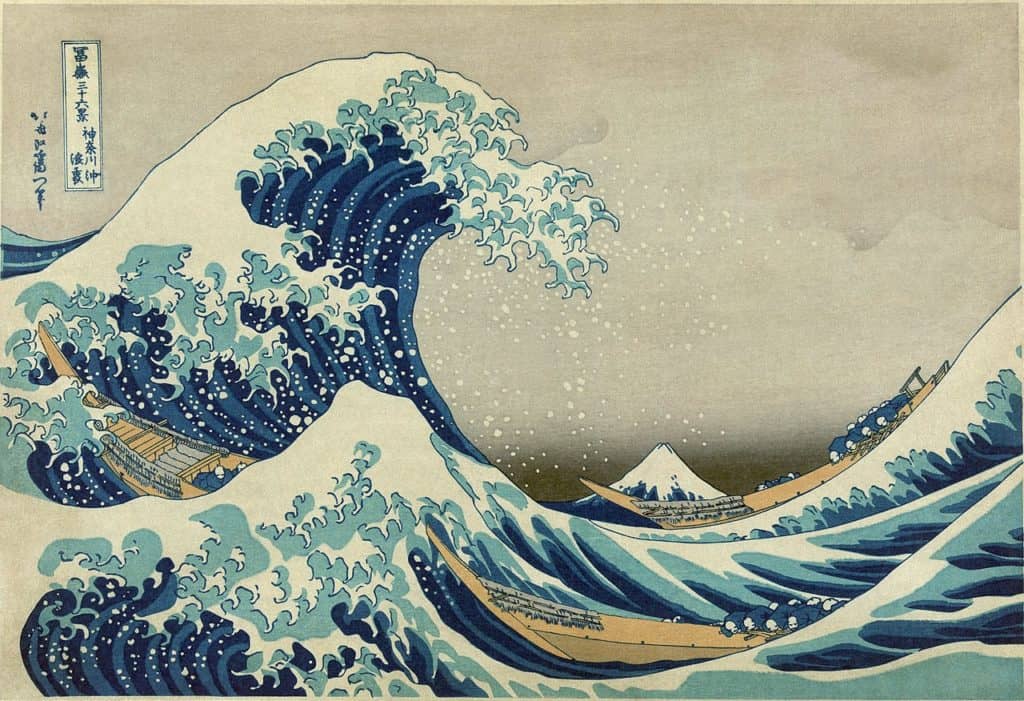
Katsushika Hokusai. The Great Wave, Library of Congress of USA, Washington, D.C. (c. 1830–1831).
When Japan’s isolationist policies finally ended in 1853, Japanese prints arrived in Europe in their droves with their striking blue landscapes, causing European artists to incorrectly deem the colour to be idiosyncratically Japanese in nature. The circulation of Japanese art and the ensuing cultural trend of Japonism art had an incomparable influence on Western art, especially on the development of Impressionism.
We should be thankful for the Japanese use of a western pigment when we admire the intensity and subtlety of both Van Gogh’s and Monet’s deployment of vibrant blues – since it was the extensive import of Japanese coloured woodcuts that inspired their use of such .
Relevant sources to learn more
In search of the blackest black…
10 Modern Moments in Colour
Agents of Change: Acrylic Paint