Articles & Features
Album Art: Ten Examples of Iconic Collaborations Between Artists & Musicians
By Tori Campbell
Album Art
Collaboration between interdisciplinary artists is nothing new — but when musicians and fine artists come together to create album art, the results can be entirely novel. From The Rolling Stones to Lady Gaga, musicians have been working with era-defining visual artists for decades to create album covers that are among some of the most interesting, controversial, innovative, and engaging cross-over collaborations of the last fifty years. Check out some of the most iconic album art of the last few decades.
1. The Velvet Underground & Nico
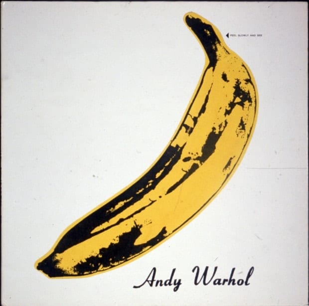
Noted for the unique pop-art print of a banana, The Velvet Underground & Nico album cover was created in direct collaboration with Andy Warhol himself, whose avant-garde ‘Factory’ studio played host to the band. The original copies of the album cover invited the listener to “Peel slowly and see”, peeling back the skin of the banana to reveal a pink fleshy coloured “naked” banana underneath. This experimental and highly conceptual feature was so unique that a special machine was needed to manufacture these covers, leading to a delay on the release of the album. Due to this laborious production method nearly all reissued editions of the album do not feature the peel-off sticker, making the limited original copies rare material culture collector’s items.
2. The Rolling Stones
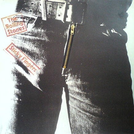
Andy Warhol’s “Peel slowly and see” concept was developed further with The Rolling Stones’ Sticky Fingers album cover. The original cover, the concept thought up by Warhol, featured a close-up photograph of a blue-jean clad crotch (with visible outline of a penis) and a working jeans zipper that unzipped to reveal an image of cotton underwear beneath. This cover too turned out to be a limited edition, as when the albums were stacked, the zippers caused damage to the vinyl and the cover itself would often rip or break. The image on the original cover also caused controversy enough for it to be censored by Spain’s Franco regime, and for Russia to create their own version of the cover in 1992, adding a Soviet Army uniform belt buckle with a hammer and sickle inscribed in a star.
3. New Order
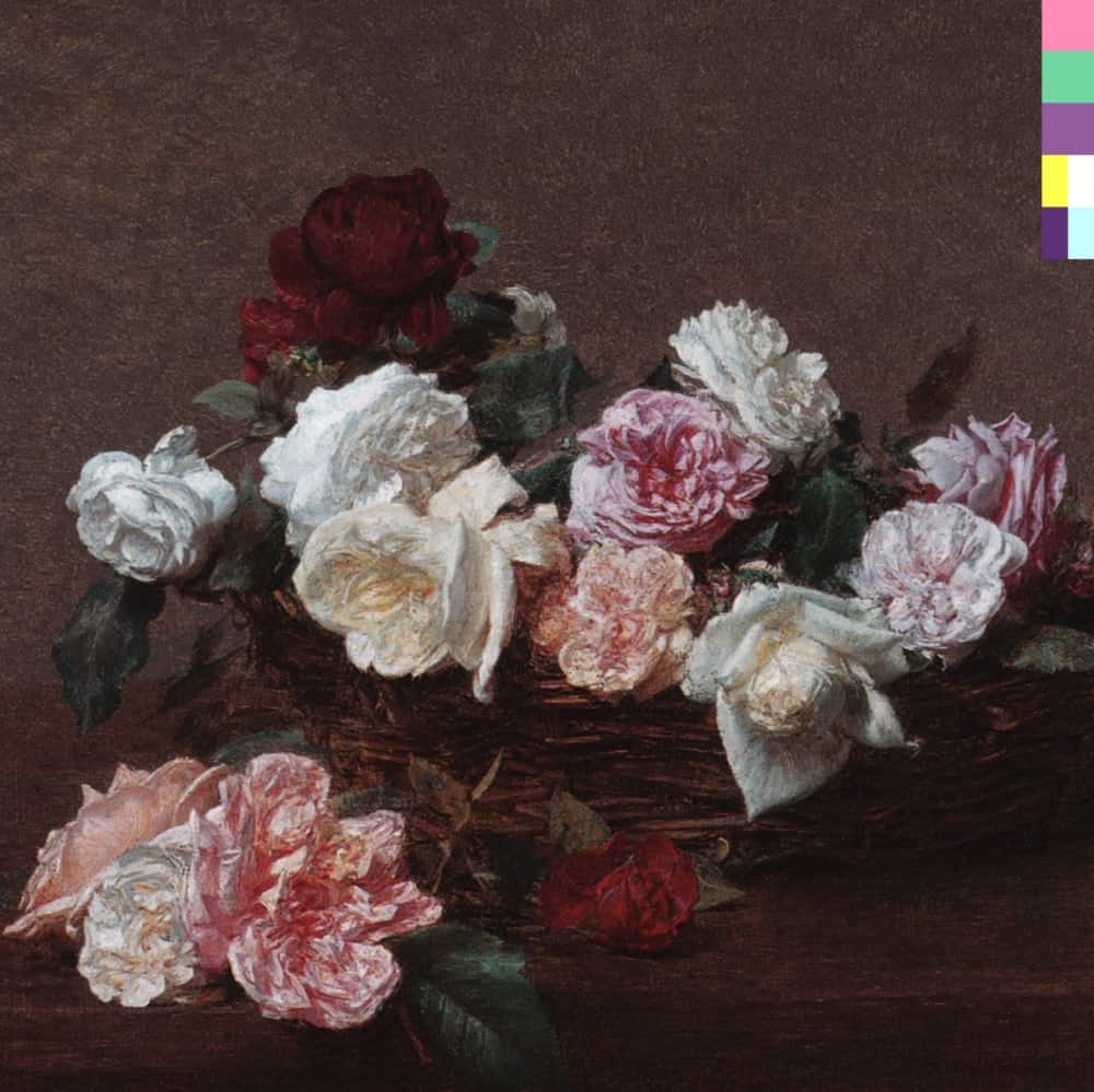
Designed by Peter Saville, the New Order’s Power, Corruption, and Lies album cover is a reproduction of French artist Henri Fantin-Latour’s painting A Basket of Roses, that belongs to the permanent collection of the National Gallery in London. When visiting the gift shop of the gallery, Saville’s girlfriend mockingly asked him if he was admiring a postcard of Fantin-Latour’s painting because he was going to use it for the cover; which he ultimately found to be a great idea though his original plan was to use a Renaissance portrait of a dark prince (in reference to the Machiavellian title). The romantic and classical image was then paired with a hyper-modern colour-based code in the top right hand corner of the cover — a representation of the band’s name and title of the album which could be deciphered using the decoder featured on the album’s back cover. Though Saville was originally refused access to Henri-Latour’s painting due to its ownership by The National Heritage Trust, his and head of Factory Records Tony Wilson’s urging ultimately secured its rights to great acclaim; they successfully argued that the painting belonged to the nation and as such could be reproduced and shared in this fashion. The cover is now iconic and has been celebrated on everything from postage stamps to high fashion house productions.
4. Guns ‘N’ Roses
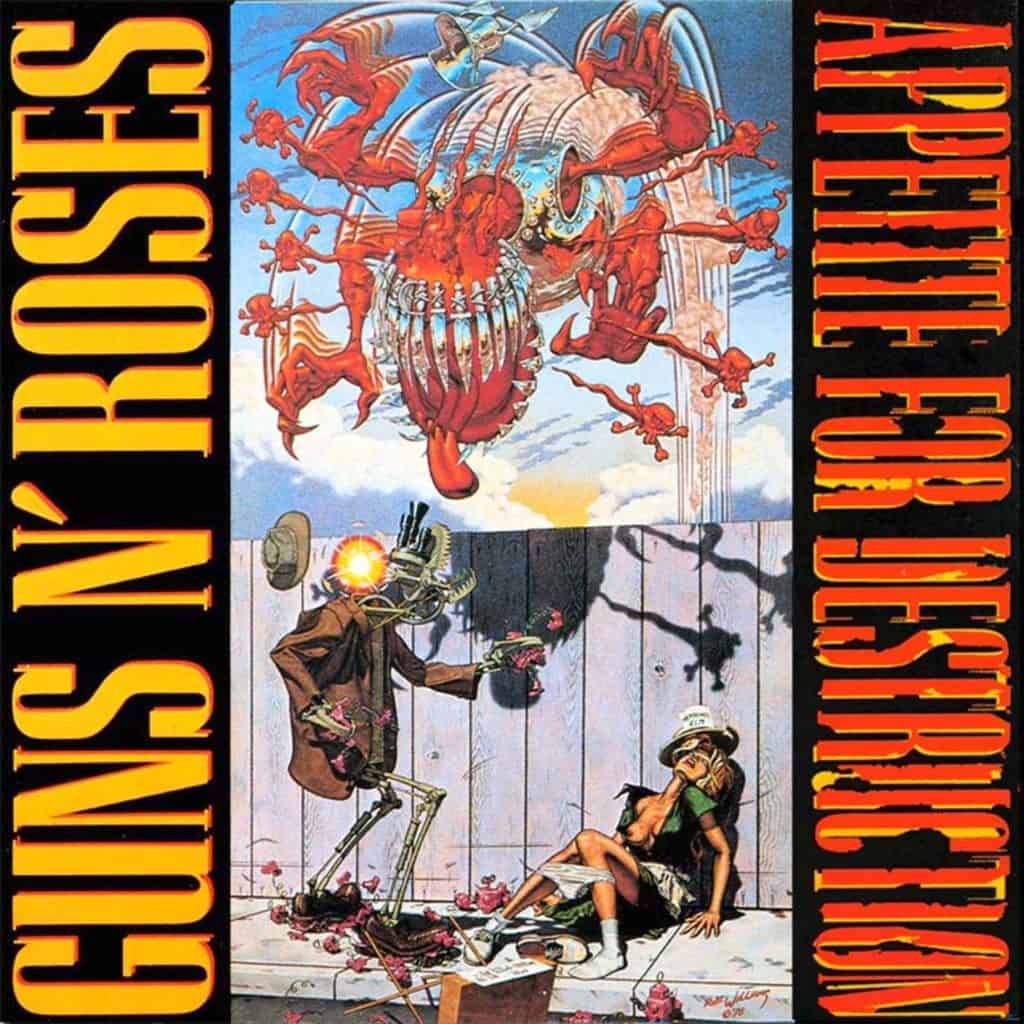
“[It is] a symbolic social statement, with the robot representing the industrial system that’s raping and polluting our environment.”
Guns ‘N’ Roses
The 1987 cover of Guns ‘N’ Roses’ Appetite for Destruction is arguably one of the most censored album covers of all time. Reproducing a work by Robert Williams, the legendary California counter-culture painter, illustrator and co-founder of Juxtapoz Magazine, Appetite for Destruction shares its title with the original painting depicting a robot rapist about to be attacked by a massive robot predator. The original cover art was obviously extremely controversial and after many music retailers refused to stock the album the record label compromised by putting the original cover inside the album jacket, and replacing it with an image of a Celtic cross and five skulls representing each band member. Though the cover that utilises Williams’ work is undeniably controversial, Guns ‘N’ Roses front man, Axl Rose, originally wanted the iconic photo of the infamous Space Shuttle Challenger explosion to grace the cover of the album instead, a choice that the record label refused.
5. Sonic Youth
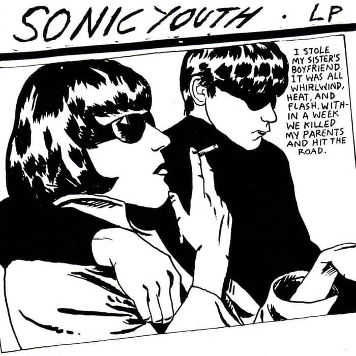
Though the album cover for Sonic Youth’s Goo is now synonymous with the band, the original album design, and even album title, was planned to be quite different. Designer Raymond Pettibon, of Black Flag album art fame (his brother is Greg Ginn, founder, singer and primary songwriter of Black Flag), originally created a caricature sketch of Joan Crawford for the album with the working title Blowjob? However, the band ultimately chose an alternative work by the artist: a striking graphic illustration of two sunglass-clad Brits based on a news photograph taken of two witnesses for the notorious Moors Murder trial, a grisly child murder crime spree that rocked Britain in the 1960s. The Goo album cover is now not only emblematic of the first generation of Indie rock, but also regarded as a piece of seminal design and held in the permanent collection of The Museum of Modern Art in New York City..
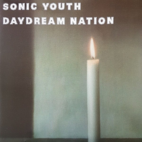
Though the cover of Goo received particularly widespread attention, Sonic Youth already had a reputation for being deeply immersed in the avant-garde of visual culture and for incorporating artists’ works into their album covers — as evidenced by their 1988 album Daydream Nation featuring Gerhard Richter’s ‘Kerze’ works on both the front and back.
6. The Stone Roses
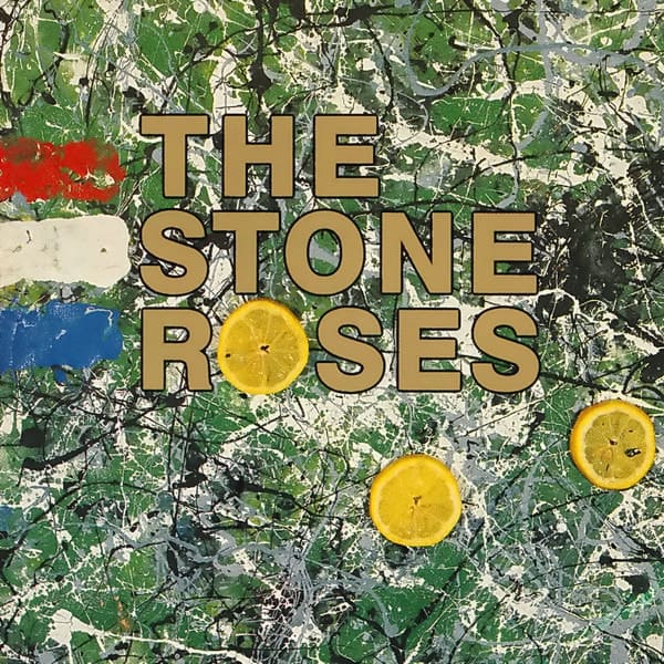
Often mistaken for a reproduction of Pollock’s work, The Stone Roses’ album art was instead directly influenced and inspired by by the work of Jackson Pollock. Created by the band’s guitarist, John Squires, he sought to faithfully reproduce the late abstract painter’s drip and splatter painting technique. Squires entitled the painting that graces the album’s cover Bye Bye Badman, inspired by a television documentary about the May 1968 student riots in Paris. At this riot the protesters famously popularised the use of lemons to neutralize the effects of the police’s tear gas, slices of which can be seen placed atop Squires’ Pollock-esque painting. In a later interview Squires admitted that he was unhappy with his initial copycat work as lacking a key visual element, the reason he added the additional compositional red, white, and blue stripes of the French tricolore.
7. Phish

One of the most celebrated of current painters, George Condo, has had the pleasure of creating two iconic album covers in his career. His first commission for the 1998 album The Story of the Ghost was for Phish, a band with a devoted and cult-like following. However, this somewhat disturbing, otherworldly, and psychedelic work, whilst typical of the painting period of the mid to late 90s that kick-started Condo’s rise to prominence, is much lesser known in contemporary popular culture than Condo’s second album commission, which came to him in 2010 from Kanye West.
8. Kanye West
“Yoooo they banned my album cover!!!!! Banned in the USA!!! They don’t want me chilling on the couch with my Phoenix!”
Kanye West’s Twitter, October 2010
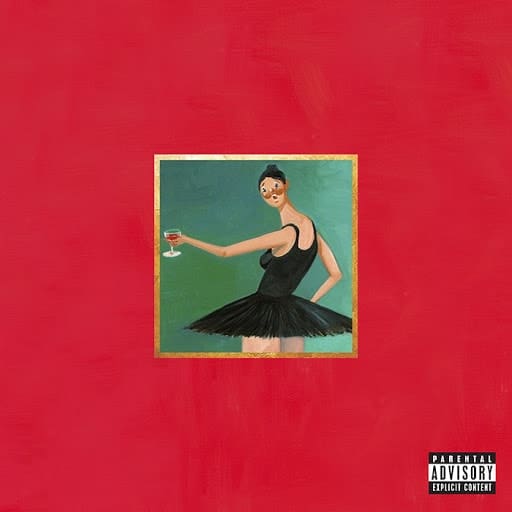
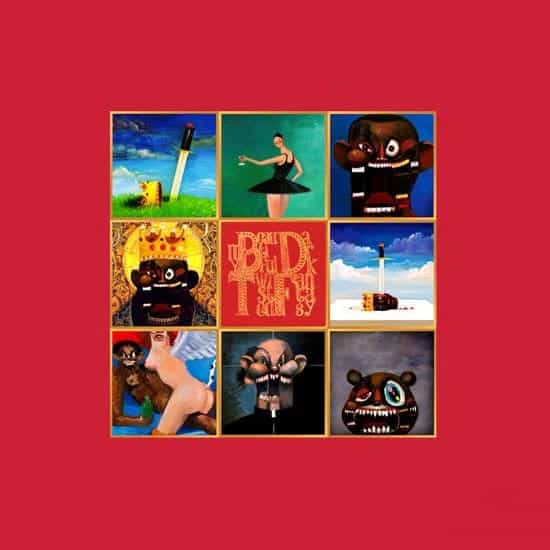
Reportedly Kanye West told artist George Condo that he wanted to have an album cover for his 2010 album My Beautiful Dark Twisted Fantasy that would get banned. Condo quickly delivered in the form of a primitive painting of a (presumably) nude Kanye West being straddled by a naked armless, winged woman with a polka-dot tail (bottom left on the gridded cover shown above). The artwork came about after West visited Condo’s New York studio for several hours, where they listened to his upcoming album and together found inspiration. Condo ended up creating many other paintings for the album (seen above), five of which were made into covers that were illustrated in the sleeve materials. So, when retailers famously refused to accept the original album cover West utilised some of Condo’s other paintings, though a pixelated-censored version of the work West originally chose remains ubiquitous — making his publicity stunt a massive success.
9. Yeah Yeah Yeahs
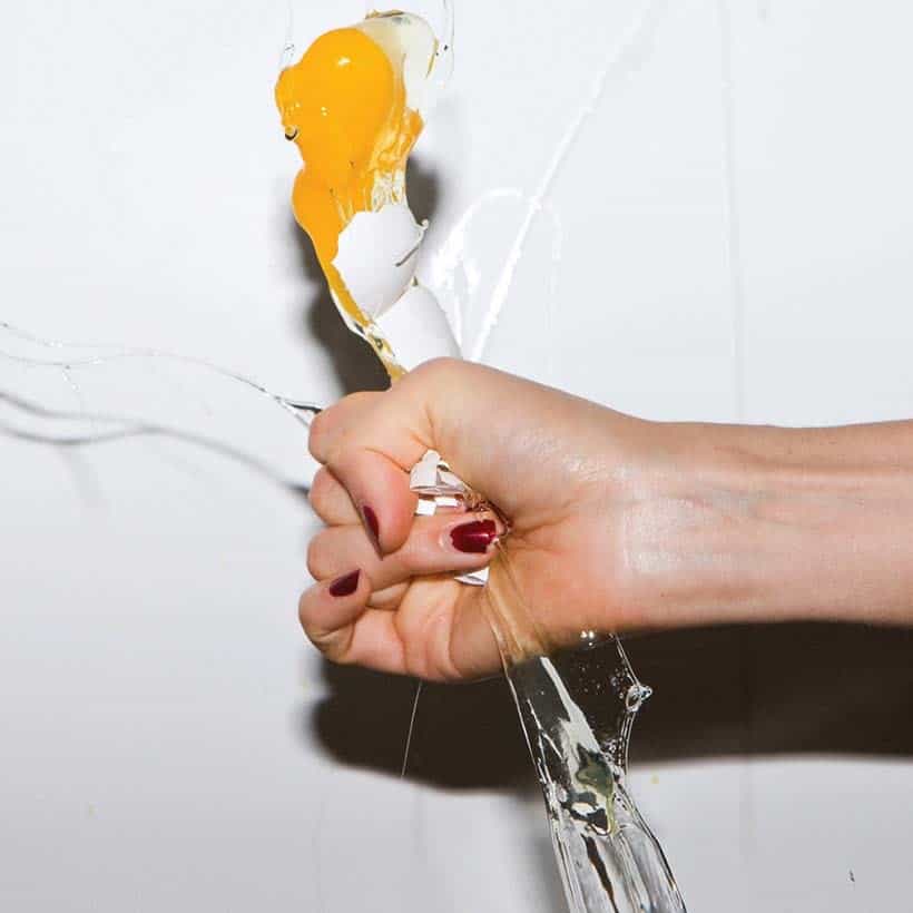
For their 2009 album It’s Blitz! the Yeah Yeah Yeahs’ enlisted the help of Urs Fischer, an installation artist notorious for the massive dirt crater he built in a New York City gallery in 2007. The Yeah Yeah Yeahs’ Karen O sought out Fischer after seeing the album cover he had created for his own band, Services, which featured a close-up image of an eye with a pool of bubbling spit in it. The image struck Karen O as it was immensely visceral, and animalistic; though unrecognisable at first glance. Fischer was then tasked to create something similarly bold for the Yeah Yeah Yeahs that would help reflect their album’s brand-new sound.
10. Lady Gaga

Lady Gaga’s 2013 album ARTPOP was created in collaboration with controversial popular artist Jeff Koons. The album art features a sculpture of nude Gaga cupping her breasts and straddling a blue gazing ball while the background is comprised of segments of famous artworks like Botticelli’s The Birth of Venus. Written in typography that Koons himself hand-collaged is the album title ARTPOP — Lady Gaga declaring the blending and collaboration between Koons’ genre of art, and her own.
Album art is the artwork that graces the cover of music albums. The artwork can be many different mediums including photography, collage, and paintings.
Who designs album art?
The musician, band, or record label often choose who will design their album art. Many famous and iconic album covers are the work of professionally trained artists who have been commissioned to create album art, or have had existing works used as album art.
Who designed Kanye West’s album covers?
Kanye West’s 2010 My Beautiful Dark Twisted Fantasy was designed by George Condo, and his 2007 album Graduation was created by Takashi Murakami.
Who designed The Velvet Underground’s album?
Andy Warhol is the artist behind the banana album art forThe Velvet Underground & Nico.
Relevant sources to learn more
Some of the most iconic album art wasn’t created by traditional fine artists: see more at Wired
Enjoy our last “Top Ten” where we explore brutalist architecture
